PlayStation vs Xbox Comparison|Infographic for Product Positioning (Canva, 2025)
Project Purpose
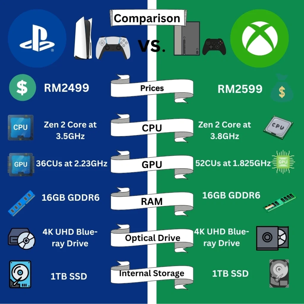
This infographic was created to visually compare PlayStation and Xbox using a clear, side-by-side format. The main objective was to help potential buyers quickly grasp the difference between the two consoles, and understand why one might be worth the higher price.
The Power of Comparison
Instead of listing specs in isolation, I used direct visual comparison to:
~ Make key differences instantly visible
~ Let customers “see for themselves” what makes a product better
~ Create a natural sense of product value through contrast
By seeing side-by-side upgrades—such as GPU speed, RAM, and storage—
consumers can more easily justify the higher price of the better-performing product.
“When people understand why, they accept the price.”
Design Strategy
~ Color coding: Blue for PlayStation, Green for Xbox — to enhance clarity
~ Icons: Help communicate tech specs to non-technical users
~ Aligned layout: Makes comparisons effortless
~ Top-down structure: Starts with pricing, then flows through key features
The entire layout is built to guide the viewer’s eye, build understanding, and support a confident purchase decision.
“Design isn’t just about looking good. It’s about helping people see clearly.”
Through this infographic, I turned technical details into a persuasive story of product advantage.